HiPart Visualization Capabilities
- Author:
Panagiotis Anagnostou
1 Introduction
In this example, we will present a few visualization capabilities of the HiPart package along with its compatibility with well established data science visualization tools.
For that purpose, we will use the Cancer dataset, which can be found in the package repository.
1.1 Initialization
We begin with the needed modules for the example.
from HiPart.clustering import DePDDP
from scipy.cluster import hierarchy

import h5py
import HiPart.interactive_visualization as iv
import HiPart.visualizations as viz
import matplotlib
import matplotlib.gridspec as gridspec
import matplotlib.pyplot as plt
import numpy as np
import seaborn as sns
1.2 Data loading
The real word dataset we utilize is in .h5 format. In what follows, we
define a custom function (h5file()) for data loading.
# h5 files input function
def h5file(data_folder, name):
    f = h5py.File(data_folder + name + ".h5", "r")
    inData = f["data"]["matrix"][:].transpose()
    inTarget = f["class"]["categories"][:]
    inTarget = np.int32(inTarget) - 1

    if inData.shape[0] != len(inTarget):
        inData = inData.transpose()
    f.close()

    return inData, inTarget

# input the data
X, y = h5file("./", "Cancer")
# y contains categories in the form of integers, and their numbering starts from -1
y = y + 1   # numbering corection
1.3 Clustering of the data
The algorithm we will use to cluster the Canser dataset is the dePDDP
algorithm. The only parametrization we will do to the algorithm is the
number of times we want the data to be split with the
max_clusters_number parameter.
We choose to use the dePDDP algorithm to cluster the data. The only
parameter provided is the number of clusters we expect the algorithm to
retrieve (max_clusters_number). Keep in mind that the algorithm have
a termination criterion by its own, so the retrieved number of clusters
could be smaller than max_clusters_number.
# Return a model which contains the the clustering of the data
clustering = DePDDP(
    max_clusters_number=np.unique(y).shape[0],
).fit(X)
1.4 Utilities
We initialize utilities for this example.
# Create a list of colors for the clusters to use
color_map = matplotlib.cm.get_cmap("tab20", 20)
color_list = [iv._convert_to_hex(color_map(i)) for i in range(color_map.N)]
2 Build-in visualizations
We begin with the split visualization of HiPart which provided a clear view of the hierarchical algorithmic procedure.
spl_viz = viz.split_visualization(clustering)
spl_viz.show()
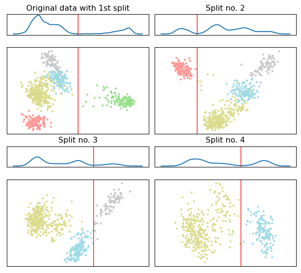
The 2d scatter plot correspond to the PCA projections used to estimate the separating hyperplane, shown in as a vertical red line.
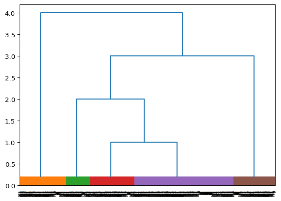
Next we utilize the dendrogram visualization, illustrated the constructed binary tree.
dendrogram_viz = viz.dendrogram_visualization(clustering)
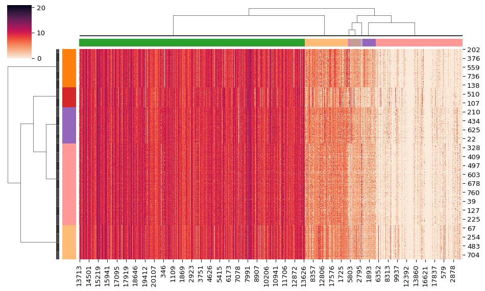
3 Seaborn clustermap()
Seaborn is a popular visualization library for statistic visualizations in {python}. It is built on the top of the matplotlib library and is also closely integrated into the data structures from pandas.
The clustermap() function from seaborn, plots a
hierarchically-clustered heat map of the data matrix. Seaborn already
provides a variety of built-in hierarchical agglomerative methods. Using
the HiPart package, you can also utilize the hierarchical divisive
methods of the package as input in the clustermap() function.
# create a linkage to represent the by row clustering
row_linkage = viz.linkage(clustering)
# craete color for the rows
row_colors = np.take(color_list, clustering.labels_.astype("int"))

# Cluster the data by column and create a linkage to represent the by column clustering
column_clustering = DePDDP(
    max_clusters_number=7,
).fit(X.transpose())
column_linkage = viz.linkage(column_clustering)
# craete color for the columns
column_colors = np.take(color_list, column_clustering.labels_.astype("int"))
heatmap = sns.clustermap(
    X,
    figsize=(10, 6),
    cmap="rocket_r",
    row_linkage=row_linkage,  # this four inputs are the key inputs for the heatmap visualization
    row_colors=row_colors,
    col_linkage=column_linkage,
    col_colors=column_colors,
    dendrogram_ratio=0.12,
)
4 Dendrogramm for evaluation
Finally, we present a dendrogram example with a color line at the bottom of the visualization. This line presents the labels of the samples for a given data matrix, when these are available.
For the creation of the figure, we will utilize the GridSpec class
of the matplotlib package. This way, we can create a figure with two
subplots. The first subplot is the axes dendro, and the second
subplot is the axes labels.
# Set figure size
fig = plt.figure(figsize=(6, 4.5))
# Create a grid with 1 column and 2 rows in which, the first row
# shows the dendrogram and must be bigger that the sendond row
# which shows the real labels. This can be achived by spliting the
# space in 26 parts.
gs = gridspec.GridSpec(25, 1, fig, wspace=0.01, hspace=0.2)

# Dendrogram subplot
dendro = plt.subplot(gs[0:24, 0:1]) # use the first 25 row of the
                                    # grid for the denro axes
hierarchy.set_link_color_palette(color_list) # use the color palet we created
den_data = viz.dendrogram_visualization(
    clustering,
    no_labels=True, # SoS: do not print labels on the dendro axes
    ax=dendro,
)
dendro.axis("off") # Do not show axis data around the figure

# color the pyrity line
colors = y[den_data["leaves"]]  # sort the samples the same way they are
                                # sorted in the dendrogram subfigure
colors = np.take(color_list, y[den_data["leaves"]]) # apply the created
                                                    # color map to the
                                                    # samples

# create the purity line
labels = plt.subplot(gs[24:26, 0:1]) # use the first 1 row of the
                                     # grid for the denro axes
labels.scatter(  # labels subplot creation with the use of a scater plot
    np.arange(X.shape[0]),
    np.zeros(X.shape[0]),
    s=65,
    c=colors,
    marker="|",
)
labels.axis([0, X.shape[0], -0.05, 0.05]) # set the axis for the scater plot
labels.axis("off") # Do not show axis data around the figure

plt.show()
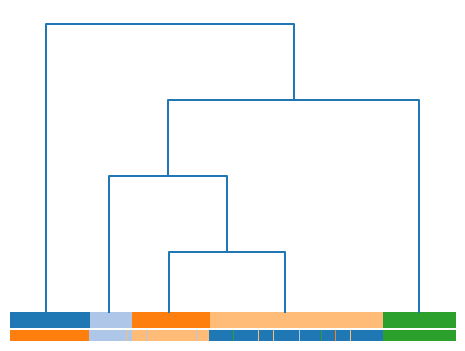
To this end, we can investigate the correspondence between the labels and the clusters retrieved from the dePDDP algorithm.